
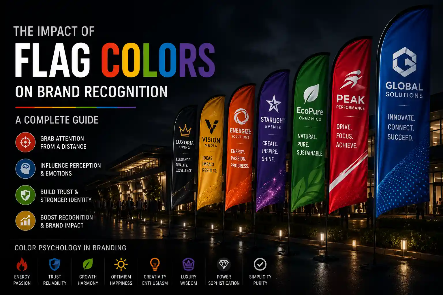
When people see a flag from a distance, they may not immediately read the logo or message—but they will notice its color, shape, and overall design. This is why choosing the right colors for a branded flag can play an important role in making a business more recognizable.
Whether used at a corporate event, trade show, exhibition, sports event, retail promotion, or outdoor campaign, custom flags can turn unused visual space into a highly visible branding opportunity.
The right combination of brand colors, typography, logo placement, and design can help a flag attract attention while reinforcing a company’s visual identity.
In this guide, we’ll explore the impact of flag colors on brand recognition, the psychology behind different colors, how to choose the right color combinations, and how businesses can use branded flags to create a consistent visual presence.

What Is Brand Recognition?
Brand recognition is the ability of customers to identify a company or product through visual or sensory elements associated with the brand.
A logo is one of the most obvious examples, but brand recognition can also come from:
- Brand colors
- Typography
- Packaging
- Logos and symbols
- Advertising style
- Signage
- Product design
- Overall visual identity
Colors are particularly powerful because people can recognize and associate visual colors quickly, often before reading any text.
For businesses participating in events or exhibitions, this makes custom branded flags an effective way to extend their visual identity into the surrounding environment.
A well-designed flag can display your brand colors prominently while making your business easier to identify from across a venue.
H1 The Psychology of Colors in Branding
Color psychology refers to the way colors can influence people’s perceptions, emotions, and associations. However, color meanings aren’t universal rules. Perception can vary depending on culture, industry, context, and personal experience.
For brands, the goal is not simply to choose a color because it has a particular meaning. Instead, businesses should consider whether the color fits their brand personality, target audience, industry, and environment.
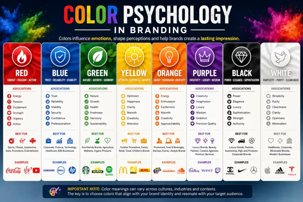
Red – Energy, Passion and Action
Red is often associated with energy, excitement, passion, urgency, and action. Its strong visual presence can make it useful for brands that want to appear bold and energetic.
Red can work particularly well for:
- Sports events
- Automotive brands
- Promotional campaigns
- Entertainment events
- High-energy activations
When used on a flag, red can create strong visual impact, particularly when combined with a contrasting color such as white.
Blue – Trust, Stability and Professionalism
Blue is commonly associated with trust, reliability, stability, security, and professionalism.
It is frequently used by:
- Corporate brands
- Technology companies
- Financial businesses
- Professional services
- B2B companies
A blue-and-white flag design can create a clean and professional appearance, making it suitable for corporate events and exhibitions.
Green – Growth, Nature and Freshness
Green is commonly connected with nature, growth, freshness, health, and sustainability.
It can be suitable for:
- Eco-friendly businesses
- Agriculture companies
- Wellness brands
- Organic products
- Environmental organizations
Green combined with white can create a clean and natural visual identity for outdoor branding.
Yellow – Optimism and Attention
Yellow is bright, energetic, and naturally noticeable. It is often associated with optimism, happiness, friendliness, and positivity.
Because of its brightness, yellow can be useful for businesses that want their flags to attract attention in busy outdoor environments.
Yellow can be particularly effective when paired with darker colors for contrast.
Orange – Energy and Creativity
Orange combines some of the energy associated with red with the friendliness often associated with yellow.
It can communicate:
- Enthusiasm
- Creativity
- Approachability
- Energy
- Youthfulness
Orange can work well for promotional campaigns, lifestyle brands, events, and businesses looking for a vibrant appearance.
Purple – Creativity and Premium Appeal
Purple is often associated with creativity, imagination, individuality, and premium positioning.
It can be suitable for:
- Lifestyle brands
- Creative businesses
- Beauty brands
- Premium services
- Entertainment companies
Purple can create a distinctive appearance when used thoughtfully with white, black, or metallic-inspired accents.
Black – Power, Luxury and Sophistication
Black can create a strong, sophisticated, and premium appearance.
It is often used by:
- Luxury brands
- Fashion businesses
- Automotive companies
- Premium events
- Corporate brands
A black-and-gold combination, for example, can create a particularly premium visual impression.
White – Simplicity and Clean Design
White is commonly associated with simplicity, cleanliness, openness, and modern design.
White is particularly useful as a supporting color because it can create contrast and allow other brand colors to stand out.
H1 How Flag Colors Influence Brand Recognition
The color of a flag can influence how easily people notice and remember a brand, particularly when the flag is displayed repeatedly across different marketing environments.
1. Visibility From a Distance
Flags are often viewed from much farther away than brochures, posters, or other printed marketing materials.
At an event entrance or exhibition hall, visitors may first see the color and silhouette of a flag before they can read the company’s name.
This makes contrast and color selection important.
A strong color combination can help the flag remain visually recognizable even when viewed from a distance.
2. Faster Brand Identification
Imagine seeing the same combination of colors repeatedly across a company’s:
- Flags
- Banners
- Standees
- Booth graphics
- Backdrops
- Signage
Over time, the repeated visual pattern can make the brand easier to identify.
This is why maintaining consistency between digital branding and physical branding is important.
3. Creating a Visual Association
When a brand consistently uses particular colors, customers may begin associating those colors with the company.
For example, a business may use the same primary color on its:
Website → Logo → Packaging → Flags → Banners → Event Displays
The flag then becomes another physical extension of the brand identity.
4. Standing Out in Crowded Environments
Trade shows, exhibitions, festivals, and corporate events can contain dozens or even hundreds of competing visual elements.
A well-designed flag can help establish a recognizable visual area around a brand.
H1 How to Choose the Right Flag Colors for Your Brand
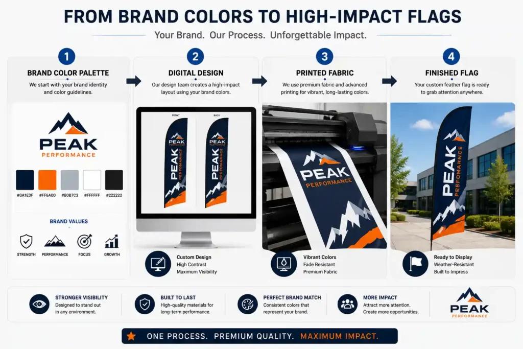
Choosing colors for a branded flag should begin with your existing brand identity rather than starting from scratch.
Here are five practical steps.
Step 1: Start With Your Existing Brand Colors
If your company already has established brand colors, use them as the foundation.
Consider your:
- Logo
- Website
- Business cards
- Packaging
- Social media
- Marketing materials
The objective is to make the flag look like an extension of your existing brand.
Step 2: Choose a Dominant Color
Select one primary color that will occupy the most visual space.
This creates a clear visual identity instead of making every color compete for attention.
Step 3: Add Supporting Colors
Use one or two complementary colors to support the main color.
A limited palette generally makes a flag easier to understand from a distance.
Step 4: Consider Contrast
Contrast is essential for readability.
Your logo and text should remain clearly visible against the background of the flag.
For example, dark text on a dark background can become difficult to read, especially from a distance.
Step 5: Consider Where the Flag Will Be Used
Think about the environment.
A flag displayed:
- Outside a showroom
- At a highway-facing location
- At a sports ground
- Inside an exhibition hall
- At a corporate event
may require different design considerations.
H1 Best Color Combinations for Branded Flags
Different color combinations can create different visual impressions. The best combination depends on the brand and the environment where the flag will be displayed.
| Color Combination | General Impression | Suitable Applications |
|---|---|---|
| Blue + White | Professional and clean | Corporate events |
| Red + White | Bold and energetic | Sports and promotions |
| Green + White | Natural and fresh | Eco and wellness brands |
| Black + Gold | Premium and sophisticated | Luxury brands |
| Orange + White | Friendly and energetic | Promotions and events |
| Purple + White | Creative and distinctive | Lifestyle brands |
| Yellow + Black | Bold and highly visible | Outdoor promotions |
These combinations are starting points rather than strict rules. Your existing brand identity should always remain the priority.

H1 Flag Design: Color Alone Isn’t Enough
Choosing the right colors is important, but color by itself doesn’t create effective branding.
A successful flag combines several visual elements:
Color + Logo + Typography + Layout + Message
Your flag should communicate the most important information quickly.
Keep the Logo Visible
Your logo should be large enough to remain recognizable from the intended viewing distance.
Keep Text Short
Flags are usually viewed while people are walking, driving, entering a venue, or moving around an exhibition.
Avoid filling the entire flag with paragraphs of information.
Use Strong Contrast
The logo and message should stand clearly against the background.
Create a Visual Hierarchy
The viewer should understand what matters most:
Brand → Main Message → Supporting Information
Avoid Overcrowding
Too many colors, graphics, messages, and design elements can make a flag difficult to understand.
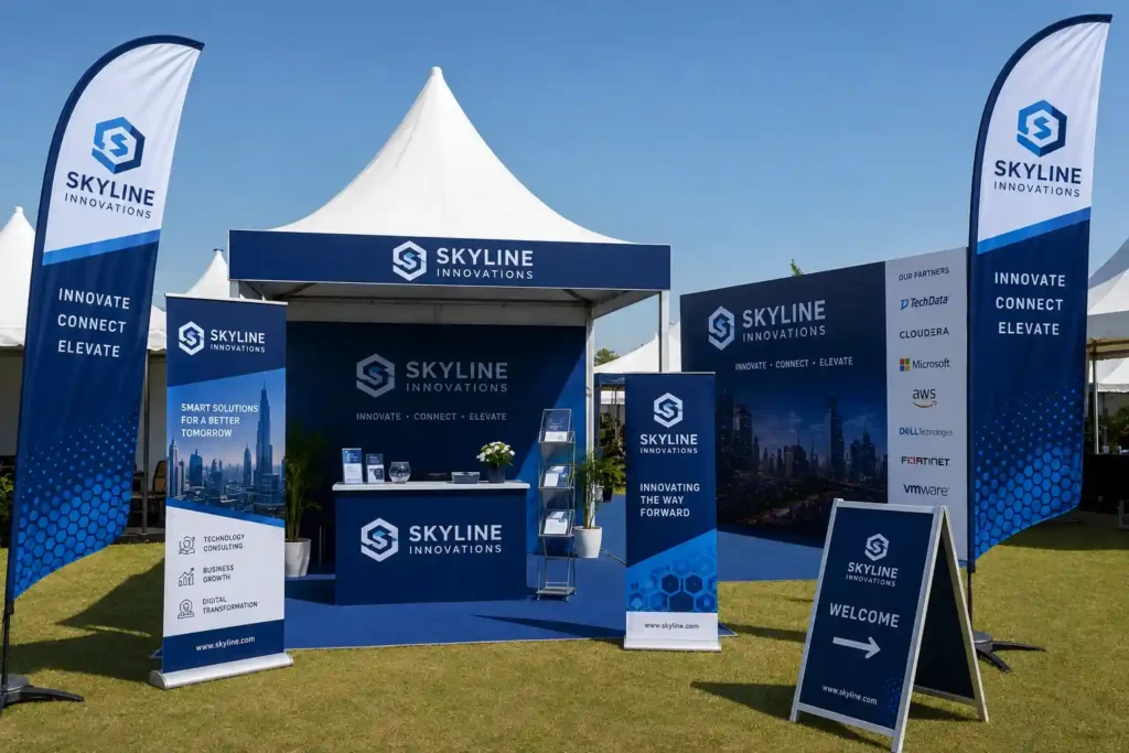
H1 The Importance of Color Consistency Across Event Branding
One of the biggest advantages of using branded flags is the ability to create a consistent visual identity across an entire event.
Imagine walking into an exhibition and seeing the same brand colors on:
Entrance Flags → Feather Flags → Fabric Standees → Banners → Backdrop → Exhibition Booth
Instead of looking like separate marketing materials, these elements become part of one visual experience.
Consistent colors can help:
- Strengthen visual identity
- Make the brand easier to identify
- Create a professional appearance
- Improve the overall event presentation
- Help visitors locate the brand more easily
Relevant Internal Links
Naturally link to:
- custom feather flags → Feather Flag product page
- fabric standees → Fabric Standee page
- event banners → Banner product page
- fabric backdrops → Backdrop page
- exhibition branding → Exhibition Branding page
H1 How Different Industries Can Use Flag Colors
Different industries can use color strategically depending on their brand identity and audience.
Corporate Events
Professional color palettes such as blue, white, grey, or other established corporate colors can create a polished appearance.
Sports Events
Bold, energetic colors can help create excitement and visibility around stadiums, grounds, entrances, and promotional zones.
Trade Shows and Exhibitions
Exhibitors can use their brand colors consistently across flags and booth displays to make their space easier to identify.
Real Estate
Real estate businesses can use branded flags around project sites, property launches, sales offices, and promotional events.
Retail Promotions
Bright, contrasting colors can help draw attention to promotional areas and entrances.
Hotels and Hospitality
Hotels can use branded flags to reinforce their identity during conferences, weddings, launches, and other events.
Automotive Events
Strong brand colors combined with bold graphics can create an energetic and recognizable display.
H1 Outdoor Flag Colors: What You Need to Consider
Outdoor flags face conditions that indoor displays don’t.
Sunlight, viewing distance, surroundings, wind movement, and the background environment can all affect how a color appears.
When designing outdoor flags, consider:
Sunlight
Strong sunlight can change how colors are perceived and can affect the visual appearance of printed materials over time.
Viewing Distance
A design that looks impressive when viewed closely may not work from 20 or 30 metres away.
Background
A flag should contrast sufficiently with the buildings, landscaping, roads, or other visual elements behind it.
Viewing Angle
Flags are often seen from different directions rather than straight on, so the design should remain recognizable across the expected viewing angles.
Print and Fabric Quality
The final appearance depends not only on the digital design but also on the printing process and fabric used.
H1 CMYK, RGB and Color Accuracy for Flag Printing
When designing a flag digitally, it’s important to understand the difference between RGB and CMYK color systems.
RGB is primarily used for digital displays such as:
- Websites
- Mobile screens
- Computer monitors
- Digital advertisements
CMYK is commonly associated with print production.
Because a digital screen and a physical printed fabric are different mediums, colors may not appear exactly the same in both environments.
This is why businesses preparing artwork for printed flags should pay attention to color specifications and production requirements.
For a more detailed explanation, read our guide on [CMYK vs RGB colour codes].
H1 Common Mistakes When Choosing Colors for Flags
Even a good brand color can become ineffective when used incorrectly.
Here are some common mistakes to avoid:
1. Using Too Many Colors
Too many competing colors can make a flag look cluttered.
2. Poor Contrast
Low contrast can make logos and messages difficult to read.
3. Making Text Too Small
A flag is usually viewed from a distance, so small text can lose its impact.
4. Ignoring Existing Brand Guidelines
A flag should normally support your established brand identity rather than introduce unrelated colors.
5. Choosing Colors That Blend Into the Background
If the flag has similar colors to its surroundings, it may lose visual impact.
6. Inconsistent Event Branding
Using different color palettes across your flags, banners, standees, and booth can make the overall display look disconnected.
7. Designing Only for the Screen
A digital design should always be considered in terms of how it will work when printed on actual fabric.
H1 Tips for Designing Eye-Catching Branded Flags
If you want your branded flags to attract attention and reinforce your identity, keep these principles in mind:
- Use your established brand colors.
- Keep the color palette simple.
- Prioritize strong contrast.
- Make your logo prominent.
- Keep the main message short.
- Design for viewing distance.
- Consider the location and background.
- Maintain consistency with your other event branding materials.
The goal isn’t to make the flag as complicated as possible. The goal is to make the brand instantly noticeable and easy to recognize
H1 Examples of Effective Flag Color Strategies
Let’s look at a few hypothetical examples.
Sports Brand: Red + Black + White
A sports brand might use red for energy, black for strength, and white for contrast.
Technology Brand: Blue + White
A technology company might use blue and white to create a clean, professional visual identity.
Eco-Friendly Brand: Green + White
A sustainability-focused business might use green and white to reinforce its connection with nature.
Luxury Brand: Black + Gold
A premium brand might combine black and gold to create a sophisticated visual appearance.
The important point is that there is no single perfect color for every industry. The best choice is the one that fits your brand identity and works effectively in the environment where your flag will be displayed.
H1 Custom Flag and Event Branding Solutions by Infinity India Flags
At Infinity India Flags, we understand that branded flags are more than just promotional displays. They are part of your company’s overall visual identity.
We provide custom flag and event branding solutions designed for businesses, events, exhibitions, promotional campaigns, and outdoor applications.
Our branding solutions can include:
- Custom Feather Flags
- Promotional Flags
- Fabric Flags
- Event Flags
- Outdoor Flags
- Fabric Standees
- Event Branding
- Exhibition Branding
- Custom Fabric Signage
Whether you’re preparing for a corporate event, launching a new property, participating in an exhibition, organizing a sports event, or running an outdoor promotion, your branding materials should work together as one cohesive visual system.
Looking for Custom Branded Flags?
Need branded flags for your next event, exhibition, promotional campaign, or outdoor location?
Contact Infinity India Flags to discuss your custom flag and event branding requirements.
H1 Conclusion: Make Your Brand More Recognizable With the Right Flag Colors
The colors you choose for a branded flag can influence how people notice, perceive, and remember your business.
A successful flag design combines brand colors, strong contrast, clear typography, recognizable logos, and simple messaging.
The most effective approach is to maintain consistency across your entire visual identity—from your website and logo to your flags, banners, standees, backdrops, and exhibition displays.
When thoughtfully designed, branded flags can become a highly visible extension of your brand and help create a stronger visual presence wherever your business appears.
Ready to make your brand stand out? Explore custom flag and event branding solutions from Infinity India Flags.